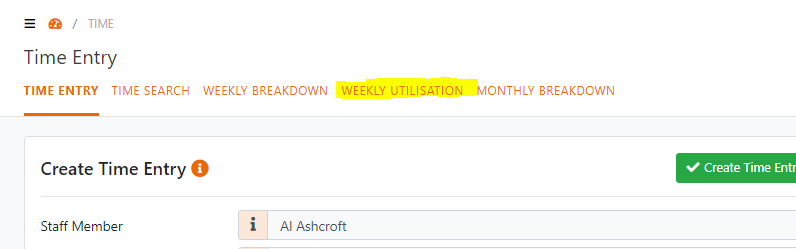
Staff Utilisation Reports
From the Time Entry menu click the Weekly Utilisation menu
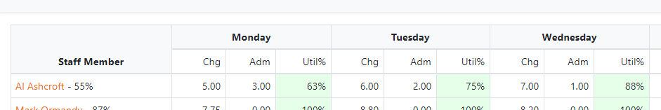
By default, the page will select your name and show your utilisation as well as any staff who report to you and hierarchically any staff who report to them and so on.
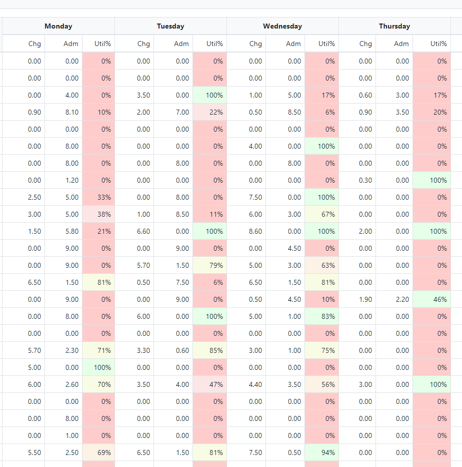
This page shows for each staff member how their time is being used broken down to each day in the week. The idea is that this can be monitored on a daily basis to make sure we are being productive.
The Util% column for each day shows the proportion of Chargeable Time vs the total Time they've entered.
These Utilisation columns are colour coded – from Green to Red showing how each Staff Member is tracking against their position expected utilisation.
Green means they’ve met their Utilisation Rate – in the above shot Al has a utilisation rate of 63% - but by his name on the left-hand side you can see the expected Utilisation for his position is 55%.
Red means less than 20% of their EXPECTED Utilisation. There is a sliding scale
Green means Good – Red means Bad
This is how it looks for this week now: